Design research
Why Single Column Design Will Benefit TD ONBOARDING
EXECUTIVE SUMMARY
TD's use of two columns forms, slows down user onboarding, and is more costly in terms of development time.
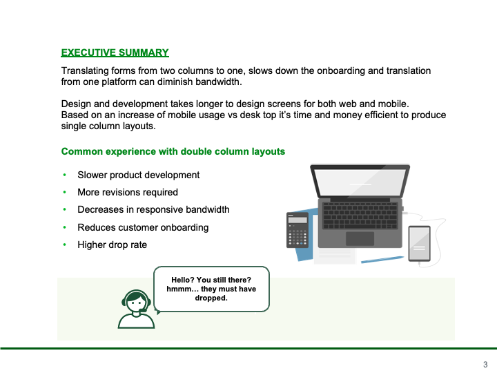
Slower product development
More revisions required
Decreases in responsive bandwidth
Reduces customer onboarding
Higher drop rate
two-column layouts can be especially tricky for accessibility. It's not all that clear what happens when screen readers hit them. The screen reader doesn't see any gutter... bingo, we have a confused reading order.
https://www.effortmark.co.uk/two-column-forms-best-avoided/

Better forms and survays
HOW MIGHT WE ENHANCE CUSTOMER ONBOARDING?
By improving design consistency
Forms in Easy Apply are inconsistently designed with a mix of single and double columns that can lead to user mistakes and an increased drop rate.
Bouncing from double column...
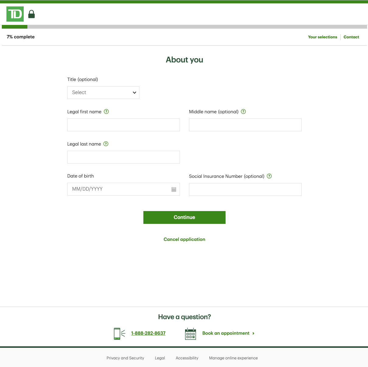
to single column...
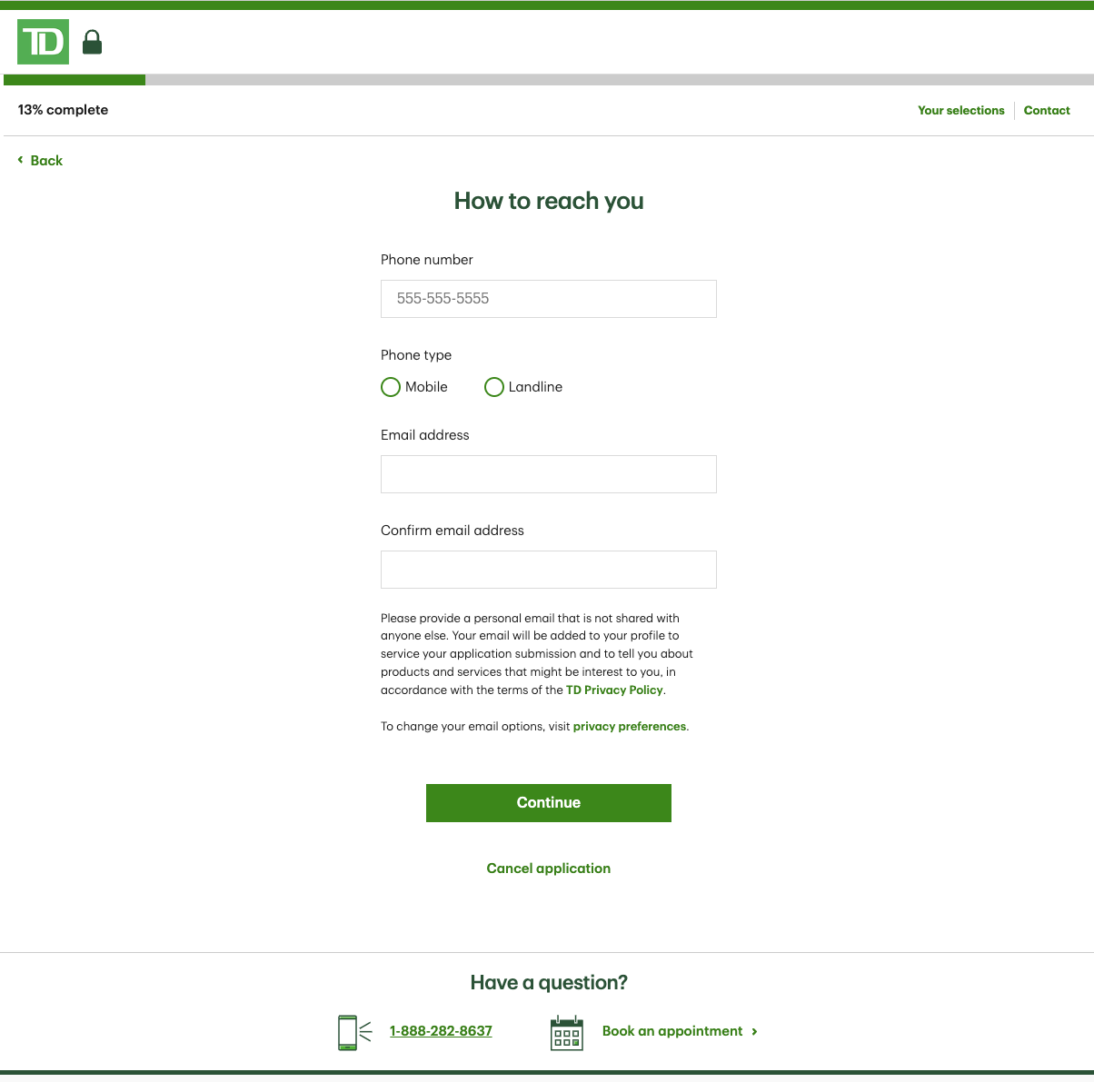
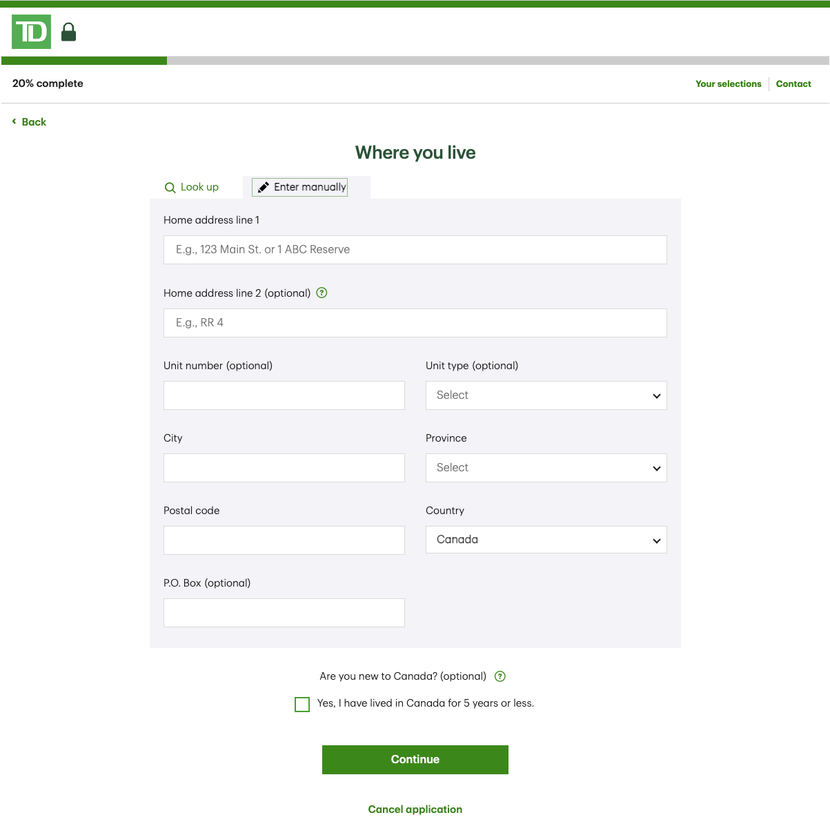



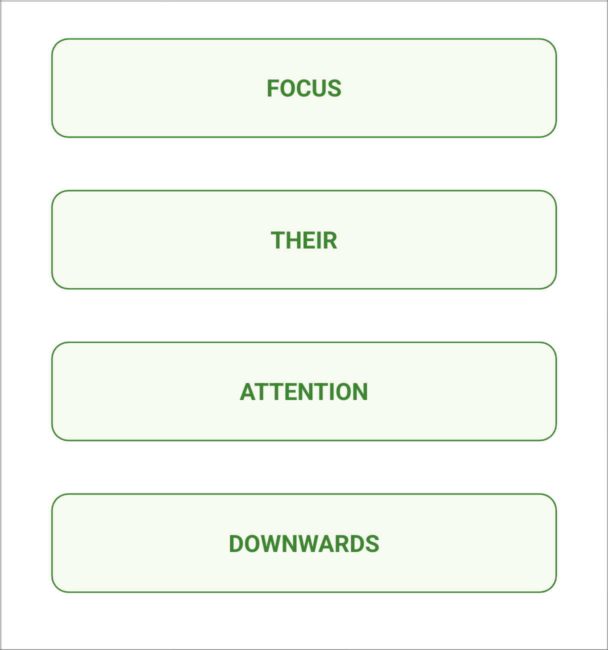
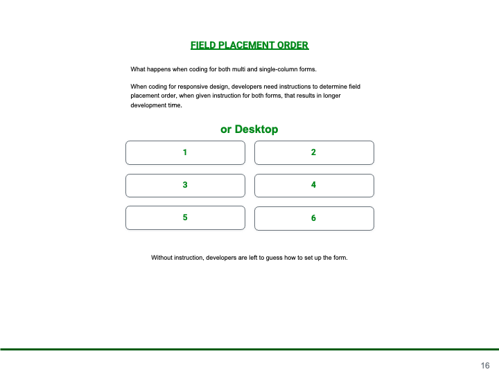
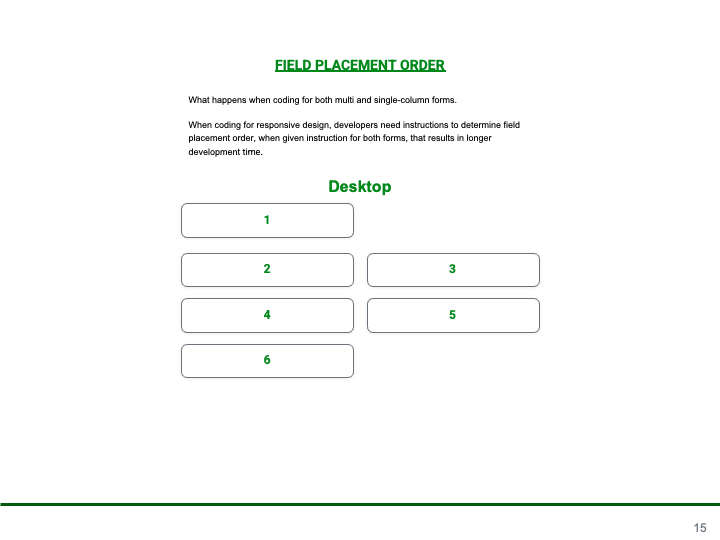
What happens when coding for both multi and singl-column forms, developers need instructions to determine field placement order for more then one layout which results in longer development time.


WHAT HAPPENS WHEN CODING FOR BOTH MULTI AND SINGLE COLUMN FORMS?
When building responsive designs, developers need clear guidance on the order of form fields. If instructions are provided for both mobile and desktop forms, it increases development time. Without guidance, developers are left to guess the layout, which can lead to errors or rework.
THE BENEFIT TO MOBILE FIRST FORM DESIGN
-
Faster Development
Developers require only one set of instruction for responsive reading order.
-
Less Revisions Needed
Less revisions are required when creating a responsive layout that works for all devices.
-
Better for Responsive Bandwidth
There is less responsive calculations when going from desktop to mobile layout.
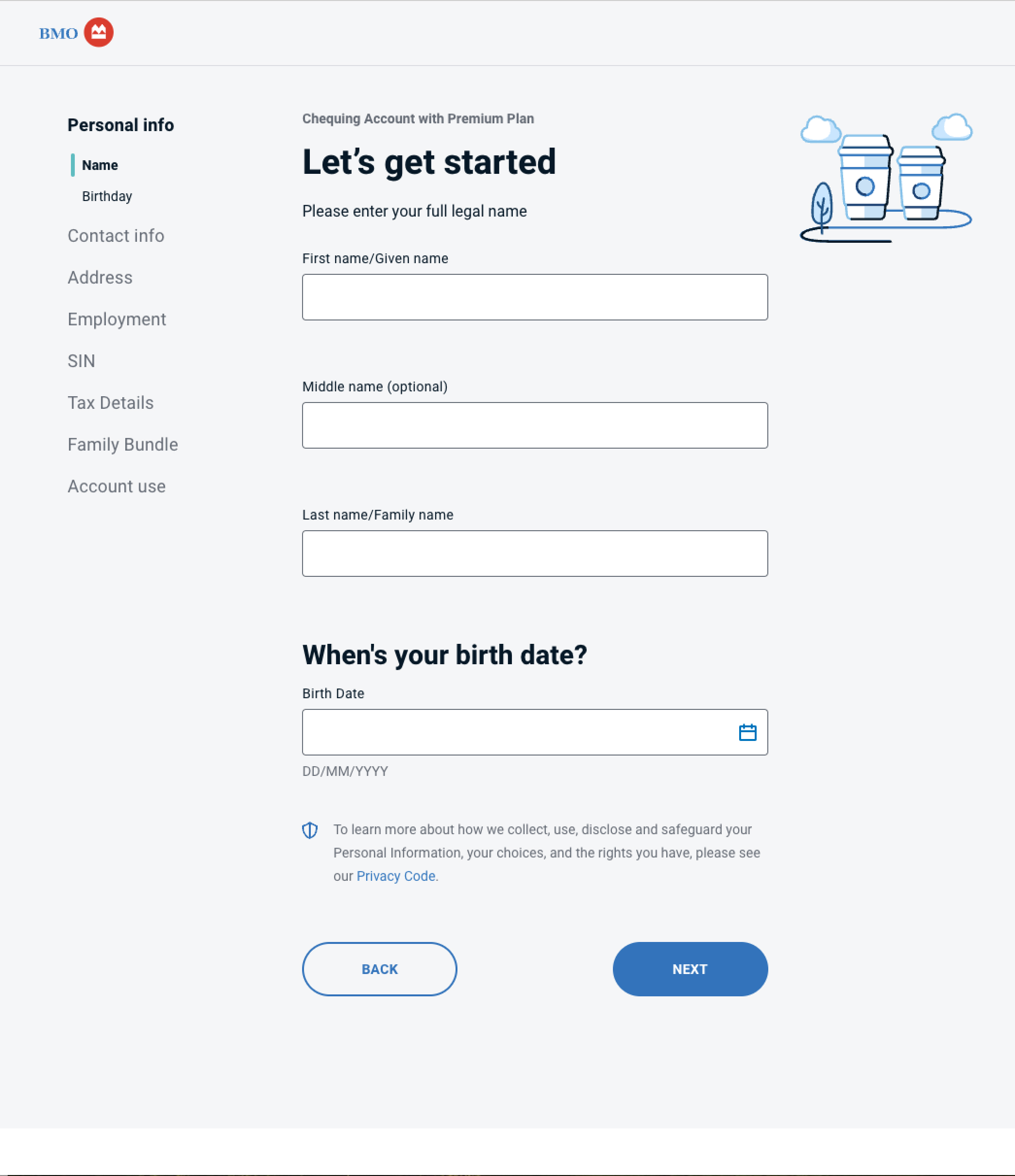
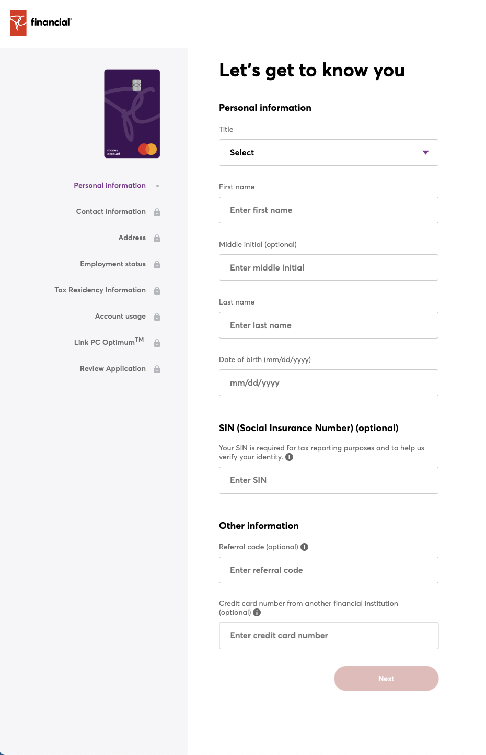
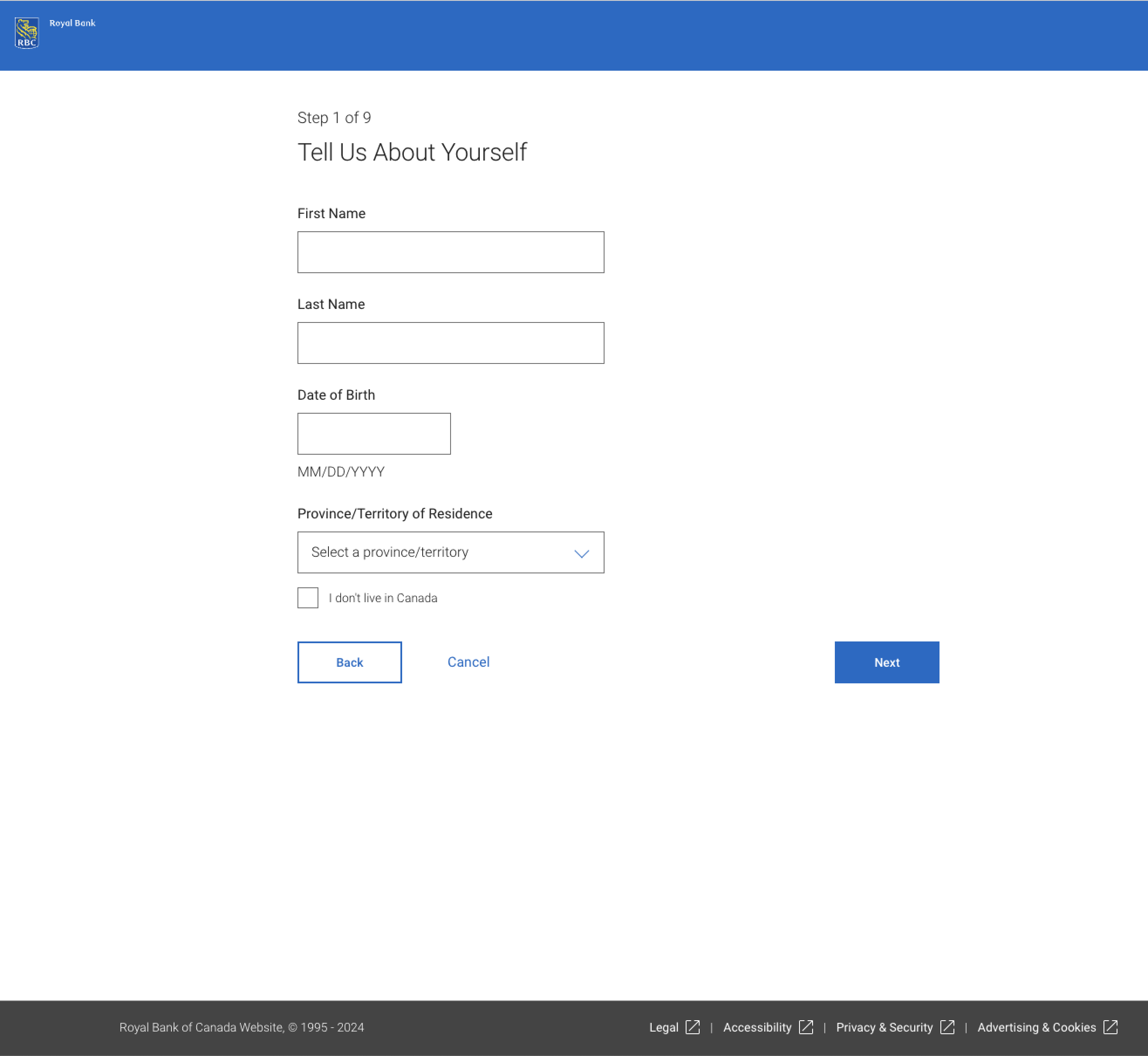
COMPETITOR ONBOARDING EXPERIENCE
CONVERSATIONAL - SINGLE COLUMN - Accessible
